

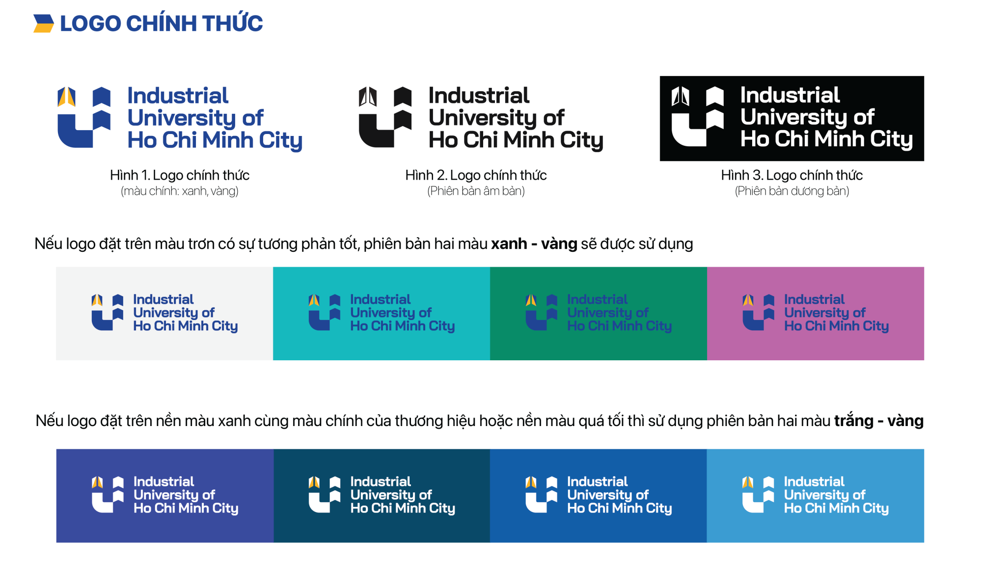
The new brand identity of the Industrial University of Ho Chi Minh City (IUH) has been developed based on the philosophy of modernity, continuity, and development, reflecting both the University’s traditional values and its vision for the future. The stylized letter “I” represents not only “Industrial”—the University’s historical foundation—but also “Innovation”—its mission of creativity and advancement. Combined with solid geometric forms and a distinctive blue-and-yellow color palette, the design symbolizes knowledge, aspiration, and sustainable development.
The image of three upward-pointing arrows embodies the University’s three core values: Innovation – Unity – Humanity, closely integrated within a modern overall composition. The first arrow is shaped like a plane taking off, symbolizing youthful ambition and the journey toward knowledge. Within the layout, the three arrows also form the letters I – U – H, affirming the University’s brand identity, pioneering spirit, and strategic vision of innovation, creativity, and sustainable development.
The image of three upward-pointing arrows embodies the University’s three core values: Innovation – Unity – Humanity, closely integrated within a modern overall composition. The first arrow is shaped like a plane taking off, symbolizing youthful ambition and the journey toward knowledge. Within the layout, the three arrows also form the letters I – U – H, affirming the University’s brand identity, pioneering spirit, and strategic vision of innovation, creativity, and sustainable development.
| STT | TÊN FILE | TẢI VỀ |
|---|---|---|
| 1 | Logo trường |  |
| 2 | Bộ logo các đơn vị | |
| 3 | Quy định về font chữ | |
| 4 | Mẫu Powerpoint | |
| 5 | Background/File trình chiếu | |
| 6 | Letter head | |
| 7 | Bảng tên để bàn | |
| 8 | Thư mời | |
| 9 | Poster | |